Simplicity seems to be the key goal when it comes to Netflix.com
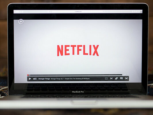
User friendly is an understatement when analyzing the interface Netflix presents to their audience. Starting with the visual presentation of color contrast, the web designers chose the colors black for its background and red for three key elements: its logo, the “Sign In” button and the “Get Started” button. The page also presents a clear and quick option to change the language translation if need be. These quick and simple options follow Ram’s principles of the product being useful, understandable and involving as little design as possible. The mechanics of this site did not leave me questioning or thinking too much.
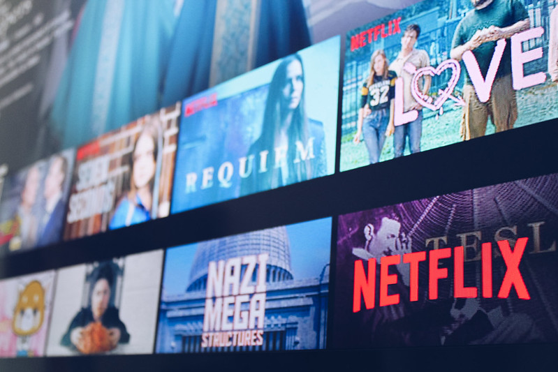
The web designers utilize the infinite scrolling method to its advantage, making the viewers scan and stop to read a quick synopsis of what content is included in their memberships and which devices they’d be able to stream from, thus emphasizing another Ram principle of honesty. The site also takes advantage of animated hover effects that allows one to get a preview of what it’s like to actually use Netflix, which elaborates on the aesthetic.
Upon muddling through, the most text you will see will be at the very end of the page where the site presents its Frequently Asked Questions portion. This, too, is extremely easy to read and is very organized. Along with Ram’s principle of being thorough to the last detail, which is exemplified in Netflix’s web design, the ergonomics used within this particular site made all of the content easy to read, easy to find and answered any questions I may have had without having to click or search for anything within the site.
Leave a Reply